As I’m sure you’ve heard, Pantone has released its colour of the year for 2020. Just in case you didn’t hear, it is: Classic Blue. At the dawn of a new decade, where there is political and environmental turmoil and with technology racing forward, Classic Blue is a reassuring, timeless hue. This blue, reminiscent of the sky at dusk, is relaxing and promotes peace and tranquillity. This blue helps focus concentration and brings clarity in these uncertain times. It may also herald a return to traditional design. The choice has not been without its critics however, it has been called “uninspiring” and “boring”.
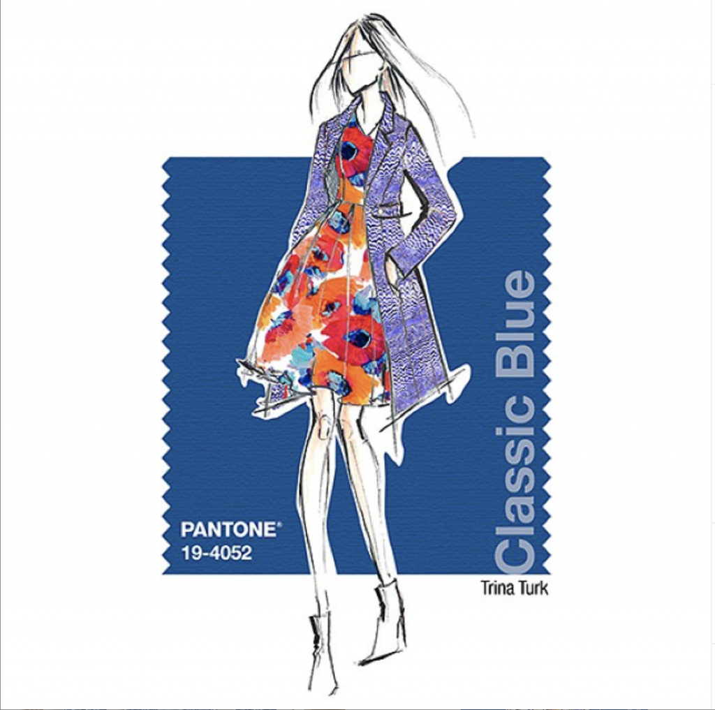
“Classic Blue encourages us to look beyond the obvious to expand our thinking; challenging us to thinks more deeply, increase our perspective and open the flow of communication.” Leatrice Eiseman, Executive Director of the Pantone Color Institute.
The Pantone colour forecast influences many industries including fashion, homewares and product design. Although perhaps not the most inspiring choice, Classic Blue is an easy shade to add to your home. Sophisticated and elegant it pairs perfectly with white. Yellow, red, orange, pink and brown wood tones can also work well. Classic Blue will suit a traditional interior, but equally can be used in a more contemporary setting. I have rounded up 9 stunning interiors which could inspire you to use this shade at home. Take a look:
9 Classic Blue Interiors

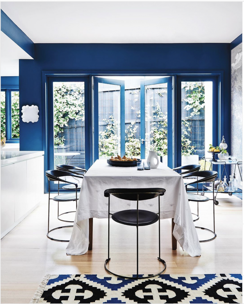
The blue wall provides the perfect backdrop in this contemporary space. Painting the door frames the same dark colour as the wall helps the wall recede. It also highlights the white countertop and tablecloth. The blue sculptural chairs and patterned rug pull the colour through the room adding balance and interest. Note, that although blue comes from the cool side of the colour wheel, Classic Blue is actually quite a warm blue and this helps make the room feel cozy.
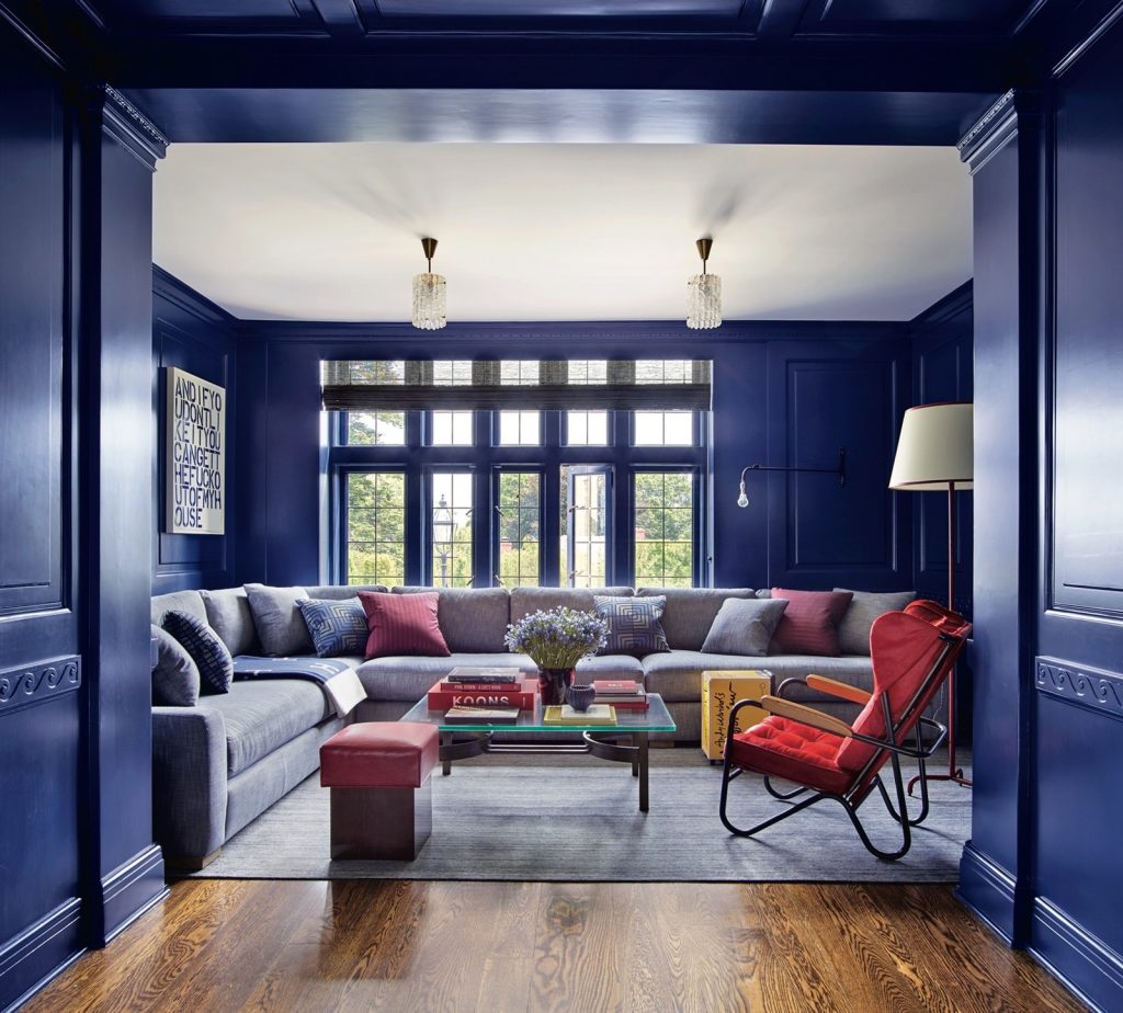
Classic Blue is used to stunning effect on the walls and woodwork in this media room.Painting the window frames the same shade as the wall is a contemporary twist for a traditional room creating a seamless, streamlined finish. Using white on the ceiling draws the eye up to increase the feeling of space. Whilst, down low, the paler blue rug and sofa allow splashes of orange, yellow and purple to shine.
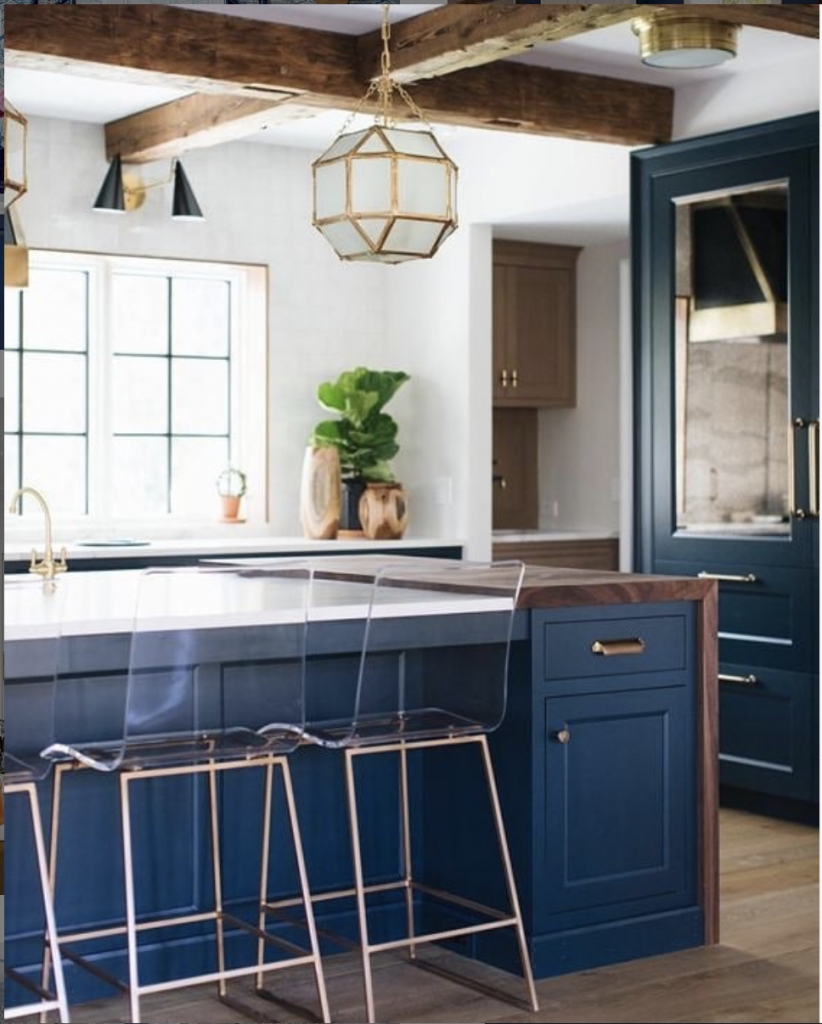
Here Classic Blue is paired with white, a darker wood (maybe walnut) and brass. This kitchen is the perfect blend of contemporary and traditional with the beams and Shaker kitchen units contrasted with modern light fittings and bar stools. I love the way the perspex bar seats put the emphasis on the clean lines of the brass legs and white countertop.
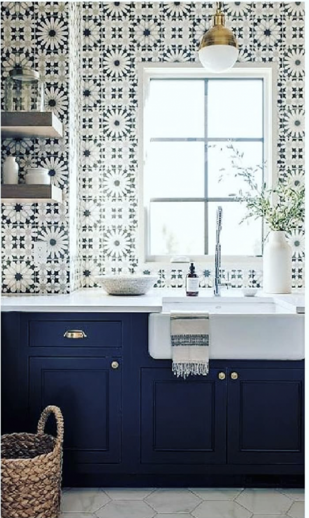
This kitchen is giving me modern, country, Moroccan vibes with the graphic tiles, farmhouse sink, tasseled tea towel and deep blue units. Fun and fresh.
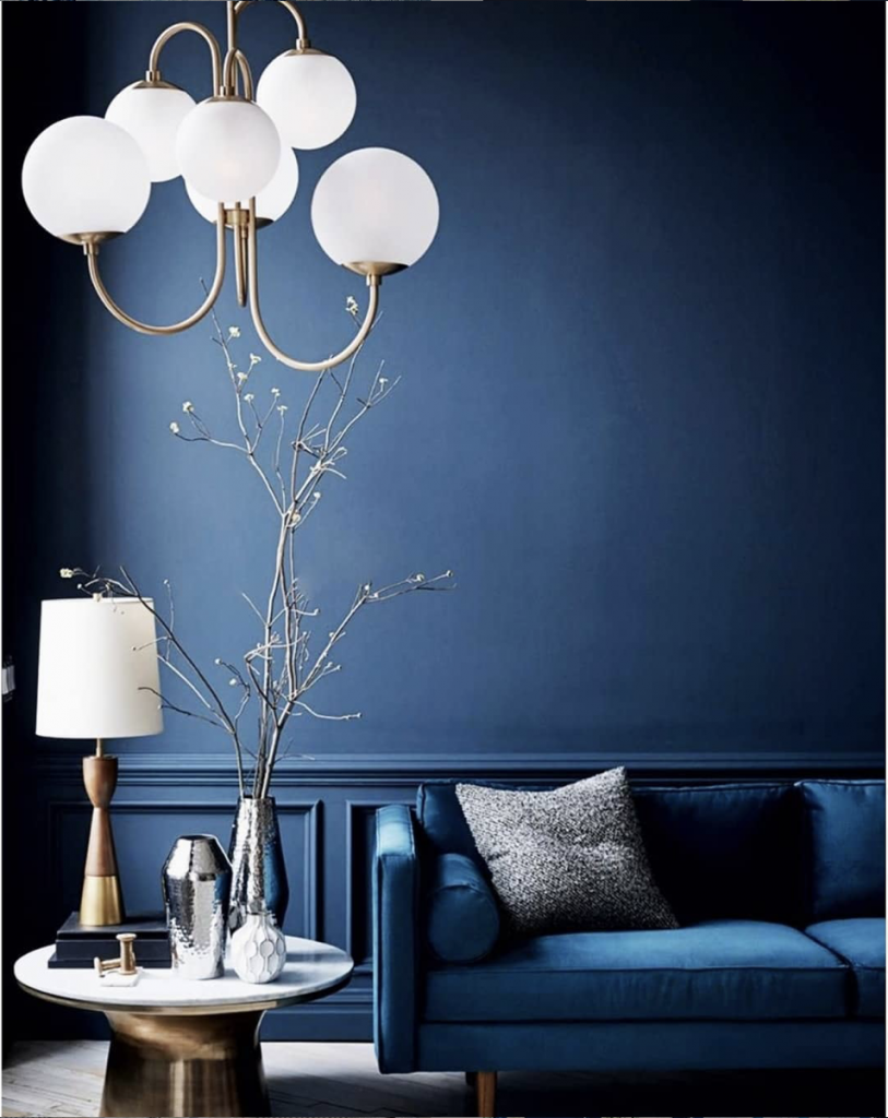
The sofa matches the deep blue walls in this moody lounge. Accents are again provided by white, brass and wood. The statement pendant pops against the darker background. This looks like the perfect place to relax and rebalance.
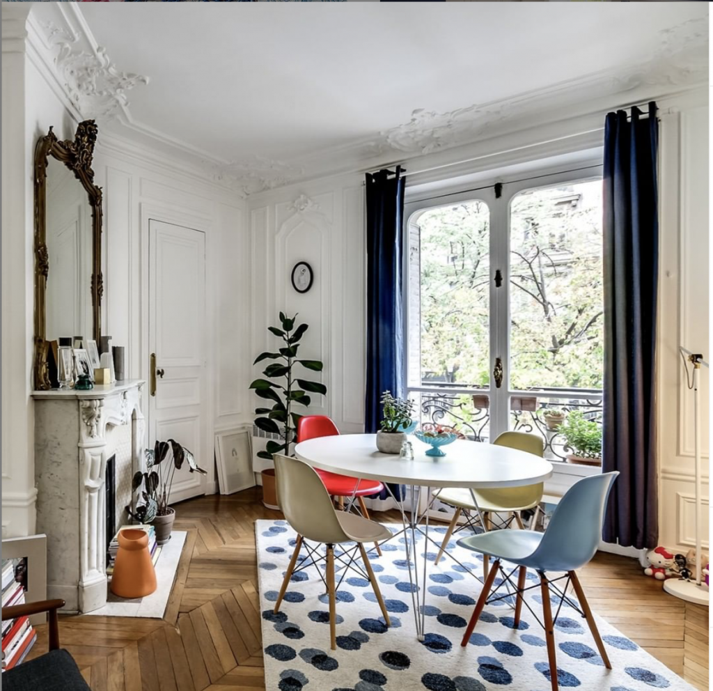
As you can see here, you do not need to go all out with Classic Blue. Just a splash on the curtains and in the patterned rug elevate this dining area.
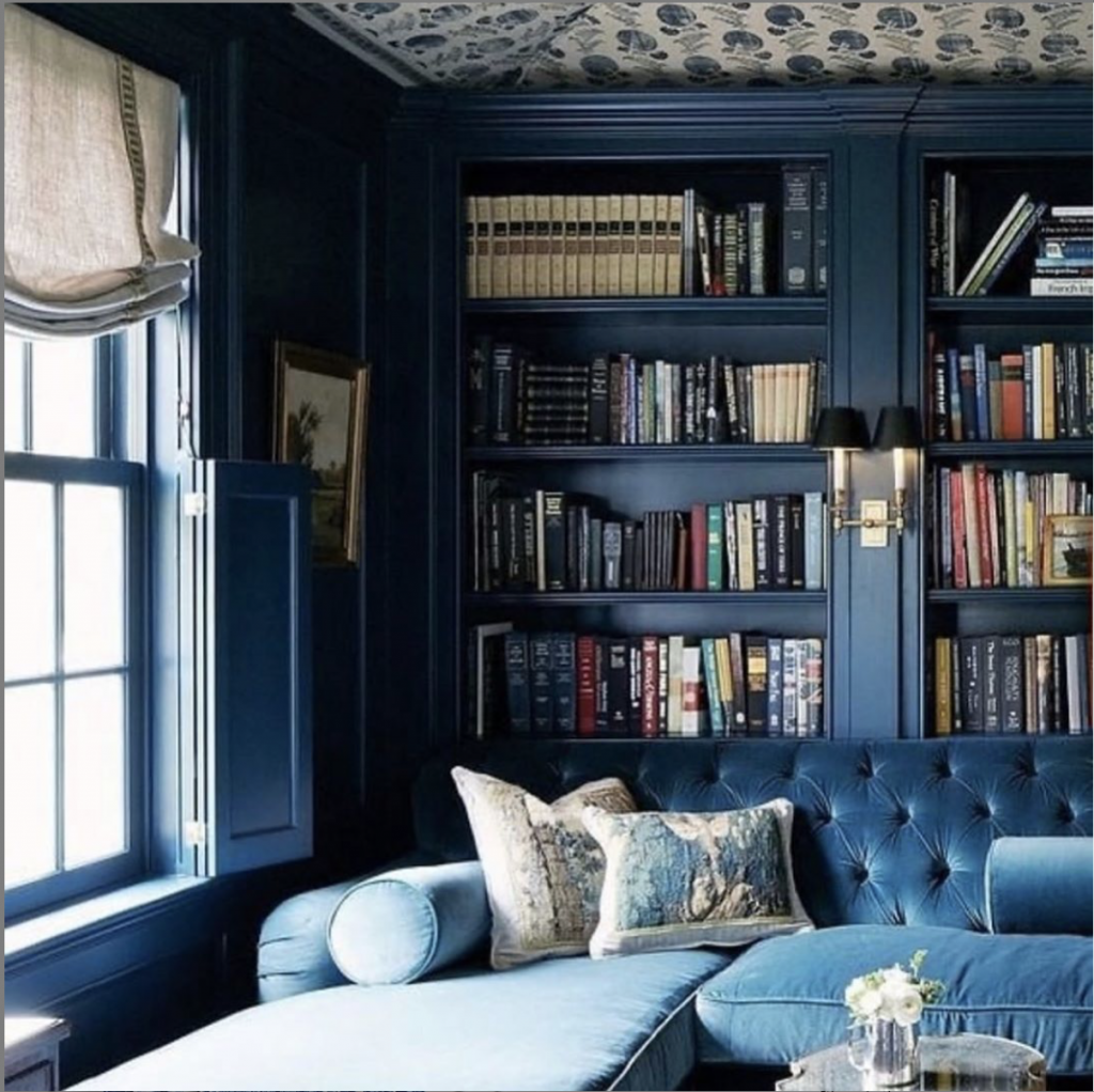
In this traditional style lounge, again, the sofa, window trim and woodwork are all in the same shade. This creates a cozy, enveloping feel and highlights the book collection.
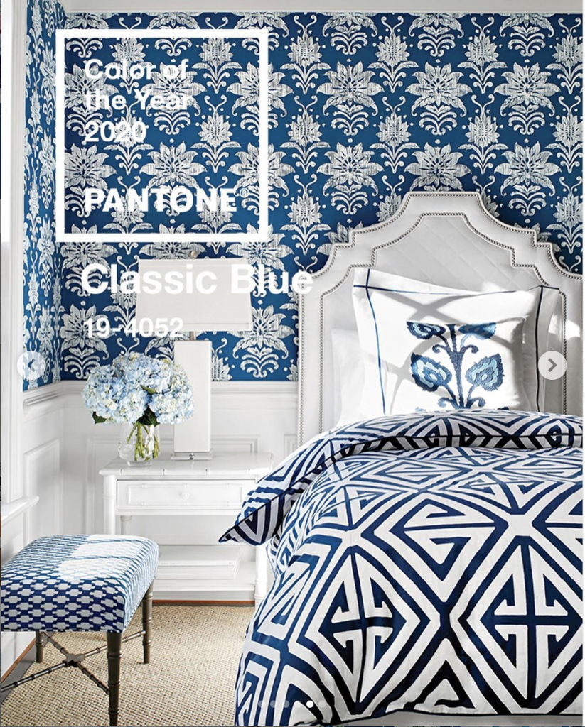
This classic guest room has some bold contrasting patterns. See how the pattern on the duvet is largest flowed by the wallpaper, followed by the stool? This difference in scale makes it easier on the eye. And the simple blue and white colour scheme unites everything. This busy uplifting vibe is perfect for a guest room.
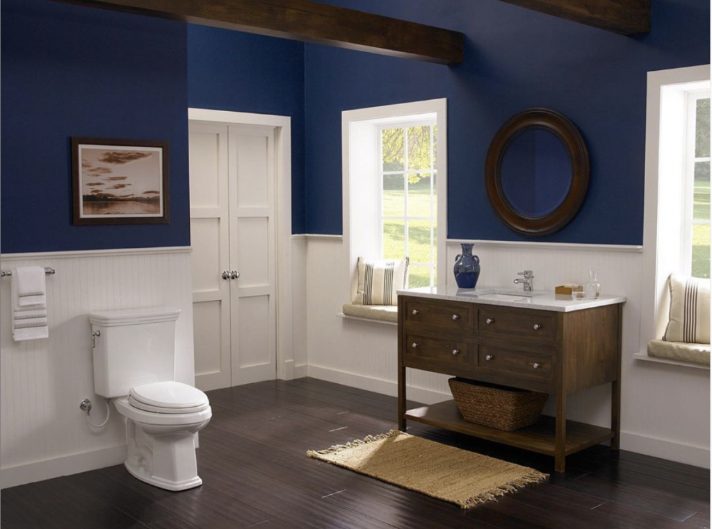
And here, Classic Blue is serene again, creating a calming and warming effect in this large bathroom. Contemporary colour blocking breathes new life into the more traditional aspects of this space.
So what do you think? Is Classic Blue a winner? Or is the “safe” choice? Do you prefer Dulux’s choice or maybe Sherwin Williams’? I happen to particularly love the colour of the sky as dusk pulls in so I am digging it. XO 💕
