This is the second in a series of posts looking at how to choose and use colours at home. In the first post we looked at where to look for inspiration. This week we’ll be looking at how to find interior colour schemes using the colour wheel. I did originally think that this, second post, would be on how to use colour (and don’t worry that will be coming) however, I reckon that we should go back to basics first. Although I’d always recommend using colours you love and looking for inspo around you, this handy tool can be great if you are new to using colour or a little unsure of your choices.
Perhaps you have a favourite colour you’d like to use but are unsure what to pair it with. Using the wheel takes the guess work out of finding a match. You can be sure you will end up with a colour palette that works. Let’s have a look at the different colour schemes and some inspiration for using them at home.
So what’s what?
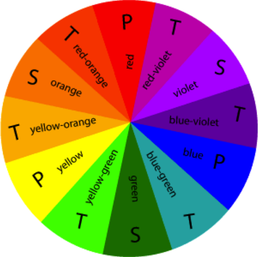
Firstly the colour wheel is made up of 12 colours:
3 x PRIMARY: Red, Blue + Yellow
3 x SECONDARY: Violet, Green + Orange
6 x TERTIARY: Red-Violet, Blue-Violet, Blue-Green, Yellow-Green, Yellow-Orange, Red-Orange
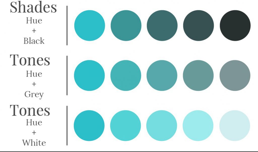
These 12 base colours are called hues. Different shades, tones and tints can be created by adding black, grey or white to the hue.
What About Neutrals?
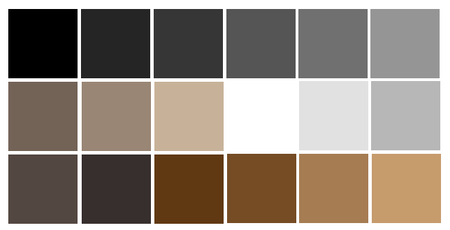
Black, white and grey do not appear on the colour wheel. This makes them neutrals. Brown, taupe and beige do not appear on the colour wheel either so they can also be thought of as neutrals (although they are sometimes referred to as earth tones). Neutrals are useful for grounding and balancing colourful schemes and, of course, can produce beautiful, chic rooms in their own right.
Interior Colour Schemes
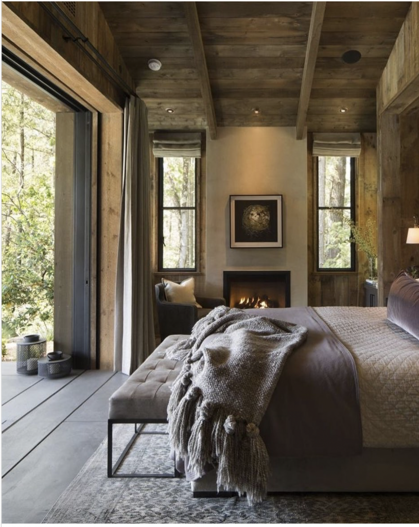
Monochromatic
Contrary to popular fashion speak monochromatic does refer to black and white, which are achromatic meaning without colour. Rather, monochromatic refers to all the shades of a single colour. Although sometimes considered boring, monochromatic spaces can be elegant and relaxing. Grab the paint card for your favourite colour and then look at all the other tints, tones and shades on the card. Using a mixture of these along with, pattern and texture, will help give your room some interest. Mixing in some black and/or white can also bring contrast, likewise with silver, gold and wood.
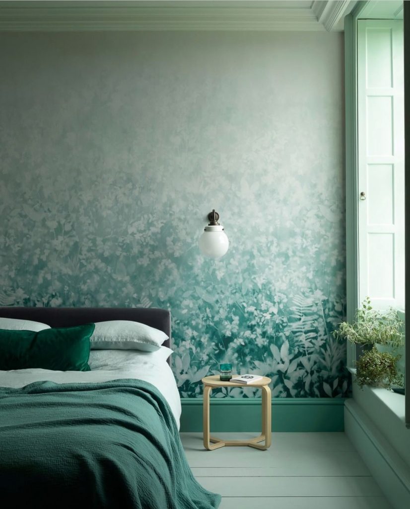
Dream in green
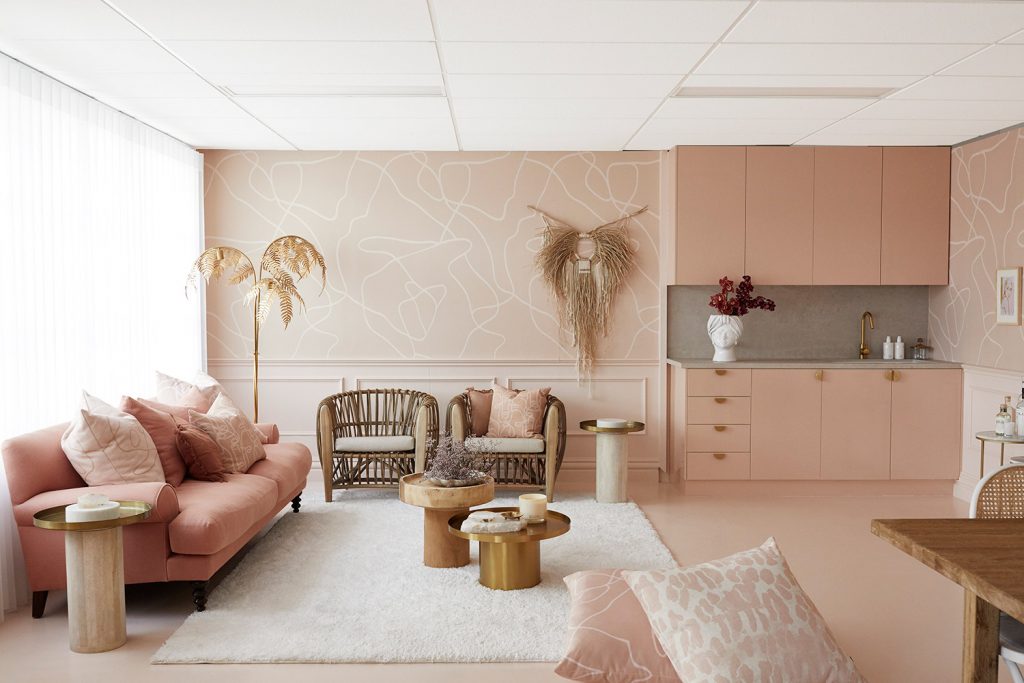
You made me blush
Analogous
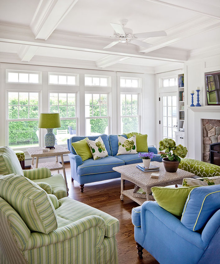
If you’d like to have a bit more colour but are just starting your foray into decorating and are scared, or you don’t want too much contrast, then analogous is the way to go. Also known as a harmonious colour scheme, these are colours that sit next to each other on the colour wheel. Two or three colours are normally used. Remember to take into account the feel you’d like for a room, as well as your own personality. Blues and green will bring a cool, relaxed kind of vibe, whereas greens and yellows offer a more tropical feel. Reds and purples will give you a much more vivid look. Harmonious colour schemes are often found in nature like the oranges, reds and yellows of the setting sun.
Green, green-blue + blue
Complementary
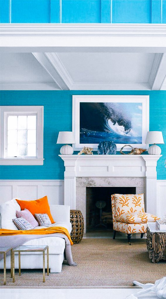
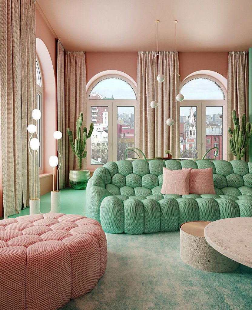
A complementary colour scheme takes the two colours that sit opposite each other on the colour wheel. For example: blue and orange, yellow and purple or current fave pink and green (pink is a tint of red). Also known as contrasting colour schemes, these can result in some striking spaces. This kind of scheme takes one colour from the warm side of the colour wheel: reds, yellows and oranges and one from the cool side: blues, greens and purples. This will provide balance in the room. Contrasting colours can create very vibrant, dynamic spaces as colours opposite each other on the wheel magnify each other. Use muted colours to take it down a notch.
Blue + Orange: Bright
Yellow + Violet: Muted
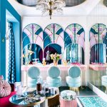
Pink + Mint
Split Complementary
This scheme takes a colour from one side of the wheel and adds the two colours to either side of its complementary colour. With this kind of scheme it is easiest to have muted versions of the two colours close to each other and use these as base colours; for example one for walls and the other for curtains and a sofa and then accent using a vibrant shade of the third colour. This is often easier to navigate than a complementary colour scheme.
Blue-green, yellow-green and pink
Triadic Colour
Next we have the the triadic colour scheme. This one uses three hues that are equally spaced around the wheel. Like red, yellow and blue or yellow-green, blue-violet and red-orange. This is known as a vivid triad and will produce harmonious, stimulating rooms. Pay attention to colour saturation. Again it will work better if you choose one dominating colour, a secondary one and accent with the third. Look at the different tints, tones and shades to find the level of vibrance that feels right for you. An alternative is a complementary, neutral triad which utilises two complementary colours and the colour in the middle between them. Using this middle hue reduces the intensity of the colours and you may find this easier to work and live with.
Red-violet, blue-green and orange-yellow
And then you’ve got tetradic which is uses two sets of complementary hues. However, by the time you’ve gone this far into colour wheel it is definitely more fun to throw it out and start looking around you for inspiration instead.
I hope this introduction to colour theory and the wheel has been helpful. If you have been strictly Scandi neutral but are now looking to dip a toe into the world of colour, then the colour wheel could be a great place to start your palette search. On that note: something I once heard with regards to colour was “Start small, paint a wall”. Which one of these colour schemes do you have at home? Would you like to shake things up for you next home decor project? Let me know in the comments.
Wishing you peace and health at this crazy time.
Stay safe. XO 💕
Flamingo Cocktail Newsletter
Sign up for tips and inspiration directly to your inbox.
[yikes-mailchimp form=”2″]