The questions I get asked the most relate to colour. One of the first things you should do when redecorating is to pick your colour palette. Once you do this, product selection becomes much easier. However, choosing an interior colour scheme can be overwhelming. There is a huge choice of shades and tones out there. So how do you figure out what to use? This is the first in a series of posts to help you choose and use colour at home. This post looks at how to find the colours that are right for you.
Colour is highly subjective and so, the best plan is to decorate with colours you love. The other thing that is crucial to think about is what kind of feeling you want to invoke. Colour can really alter a mood. Think about how you use the space and how you want your guests to feel in it. My guess is that you want a home that feels happy and inviting but do you want a calm, relaxing lounge or an energising one that stimulates conversation? Colour schemes can be clean and bright, dark and moody, warm and cozy or soft and subtle. Keep that in mind while you are looking. Here are 10 places to find your interior colour scheme:
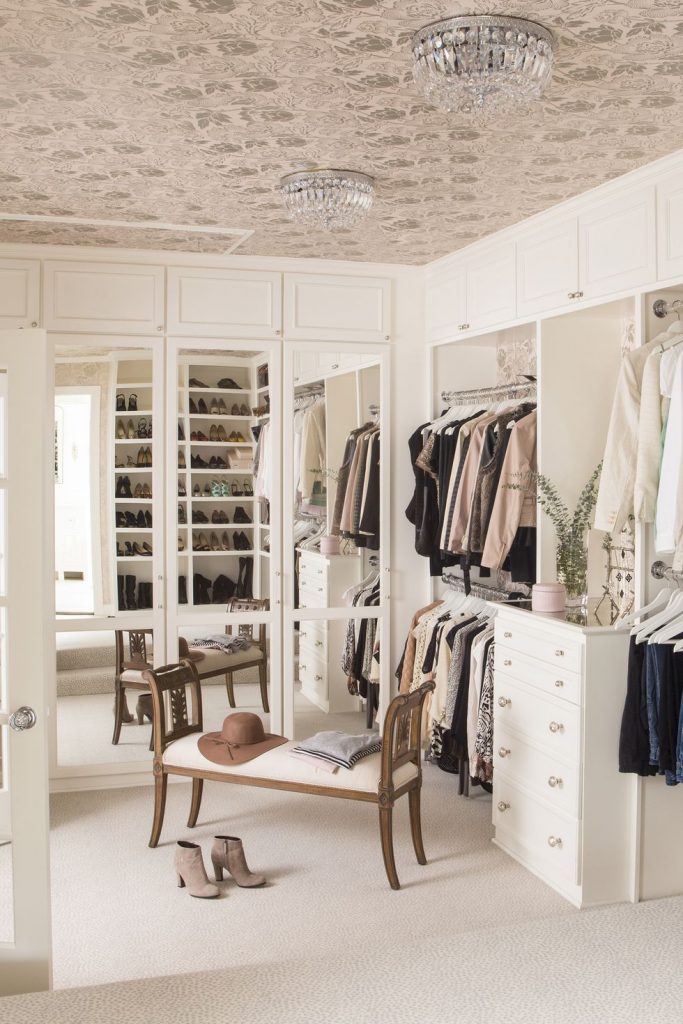
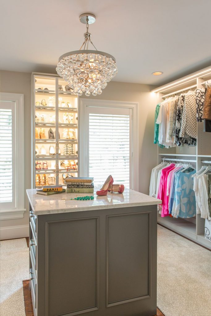
1) Your Wardrobe
Chances are that your clothes are not only in colours you love but also ones that flatter you. Absolutely perfect for your home. If your wardrobe contains mostly black and you don’t fancy an all-black house (although it can look incredibly chic and cosy) check out this post for colours that flatter everyone.
2) Nature
Many colour schemes are inspired by nature. Coastal and Tropical are two entire design styles based on nature. I absolutely love the pinks and blues in the sky just after sunset and if I lived alone I’d probably use them in every room. Endless rooms are inspired by beach life colours. Or maybe forests are more your jam, or parks, or flowers. Get out and start taking photos of any colour combos that you are drawn to.
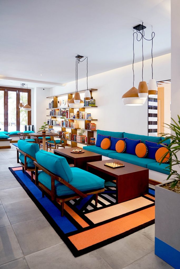

Image via: Inspiration Design Books + Tourism Mauritius
3) Travel
Traveling to new places is a well-known route to feeling creatively inspired. Somewhere new opens your eyes and stimulates the senses. Think of the blue and white of Santorini, the pastel houses in Lisbon, brightly painted fishing boats on a beach, the exotic colours of Morocco or India. Take note of colours that make you feel happy. Think about whether they relax or energise you and take photos to remind yourself when you get back home.
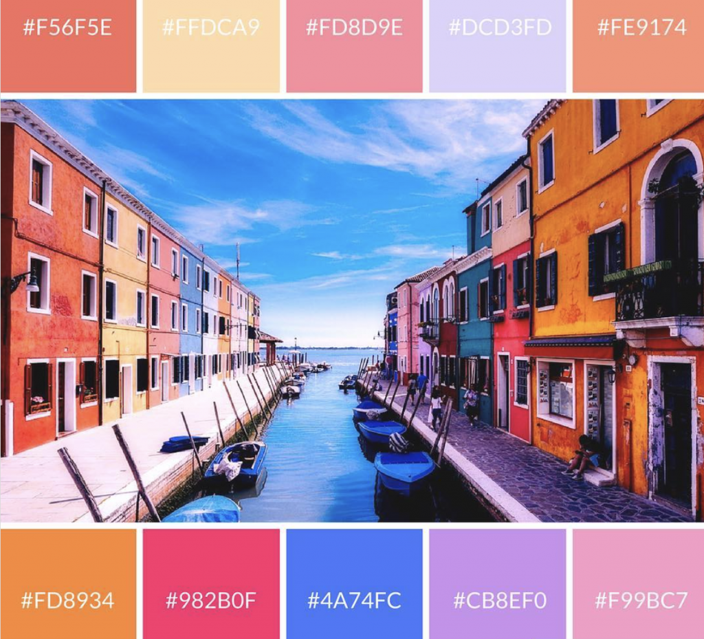
Image via @freecolourpalettes
4) Daily Life
Although travel is a common source of inspiration this doesn’t mean you can’t find it back home. Check out good looking local restaurants and shops, displays in shops, fashion, even brand packaging. Good branding has been carefully thought out. In the schemes you are drawn to look to see which colours dominate and which are used sparingly as accents.
The
5) Online/Publications
Of course, there is also endless inspiration online from Instagram to Pinterest to design and style bloggers. Colourful interiors are trending right now. Create a Pinterest board and pin images with colours you love. You don’t have to stick to interiors either. Check out photography, fashion, film posters. You can look at a wide range of books and magazines too. Photocopy or tear out images that attract you and keep these together.
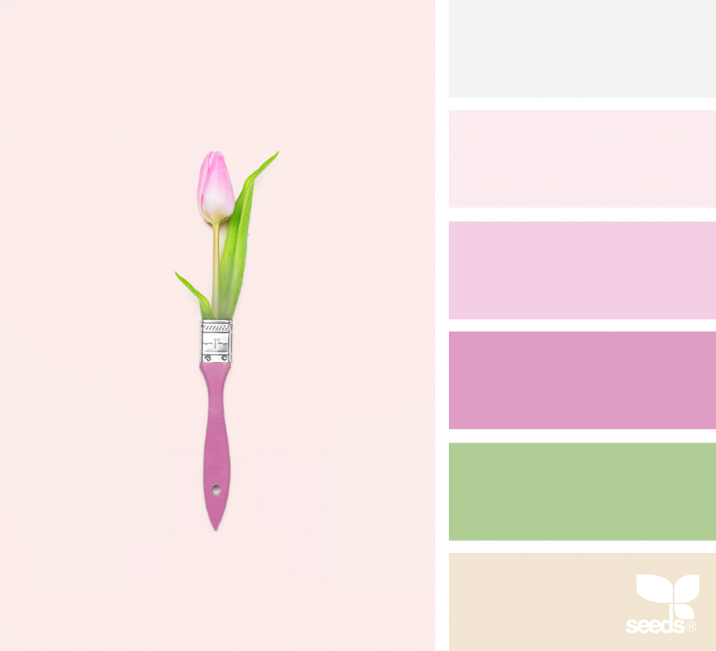
6) Design Seeds
Design Seeds is an excellent resource with lots of images broken down into their individual hues. You can search by colour or category, such as beach, nature, heavenly hues etc. Look at gentle, soft hues as well as the attention grabbing brights. Perhaps you are more drawn to a quieter scheme.
7) Art
A different way to approach making your selection is to start shopping. Find a piece of art that you absolutely love and take your colours from there. Artists make a career out of studying the relationships of colour. If you already own an artwork which you wish to hang in the room then you already have your starting point.
Image via @jackdmarch
8) Rugs
In the same vein as art a colourful rug can give you your colour scheme. Whether you are drawn to a contemporary abstract or geometric design, a more traditional style, or a Kilim or Berber. Rugs can make an eye-catching statement and ground a colourful scheme. Choose rugs and fabrics before paint as paint can be mixed to virtually any shade whereas soft furnishings are a bit more limited.
Image via NW Rugs
9) Fabrics
If you don’t want a big statement on your floor but you would like to use a mix of colours then find a fabric to tie your colours together. Perhaps you may see something beautiful at a market or your local fabric store. If it is quite colourful and you are worried, remember you can just use a small amount on a couple of throw cushions and just pull a couple of colours from it. And remember, it is much cheaper to repaint your walls than recover your sofa when you want a change.
Image via Matthew Williamson
10) Architectural Style + Interior Finishes
You may already have furniture or flooring that you are going to keep. It is best to consider these before selecting a colour scheme. Think about how architectural details like mouldings will look in your chosen colours. You may find inspiration in the architectural style of the home. For example Victorians had quite dark colour schemes that used blue, dark green, maroons and browns. If this sounds a bit heavy consider mixing in some lighter shades to make it feel more modern. Conversely giving a period home a contemporary interior can also be very effective. Room orientation should also be taken into consideration as light affects colour.
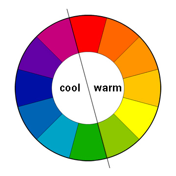
Using the Colour Wheel
Ideally you want 3-5 colours per room and the colour scheme should connect to the other rooms in your home. Generally, a scheme works best if you take from both the warm (reds, pinks, yellows and oranges) and the cool (blues, greens, purples) sides of the colour wheel. Choose either cool or warm as the dominant colours and accent with the other. Metallics also count. Black, white and grey are considered neutrals.
Monochromatic
Monochromatic schemes is another way to go. This is where you use several tones of one colour. These can be successful but sometimes can be a bit boring. To avoid this try to select a variety of shades and tones and mix in black, grey, white or brown. We’ll be looking at these in more detail in a future post.
One last thing….
Obviously, if you live with someone else, you will (unfortunately) have to take their colour preferences into account as well. This often makes things harder but look for commonalities. For example: I love all kinds of blue and pink, but my Aussie is not really down with pink. However, he does like turquoise and darker blues so that gives me something I can work with (….although I am going to slip some pink in to our yacht somewhere……hope he doesn’t read this 🙂 ).
I hope this has given you some ideas of places to look for colour inspo. If you’d like to start right now then check out some of my other colour posts. Stay tuned for the second post in this series where we’ll be looking at how to use colour.
P.S. If you liked this post please share the love using the buttons below.
XO 💕
[yikes-mailchimp form=”2″ title=”1″ description=”1″ submit=”Subscribe “]