American paint manufacturer, Sherwin Williams, has released its predicted colour trends for 2020. To reach their forecast colour marketing director Sue Wadden, and her team, studied global trends in colour, design and pop-culture. Sue Wadden told Architectural Digest that, “this year, she was looking to counterbalance the cacophony of stresses that are an increasing factor of contemporary life.” Take a look below for the 5 colour trends she expects we’ll be seeing in 2020.
The colours selected represent joy and serenity. As the wellness trend continues, the home is treated as a sanctuary. A welcoming respite from the busy world, a place to balance the mind, body and spirit. There are 45 colours arranged into 5 groups, each contains 9 hues.
Now, I would never advocate blindly following trends, particular with colour which is so subjective. As I have said before, it is always best to decorate with colours you love. However, if you are not super confident when choosing colour, and you feel drawn to one of these palettes, then this could be a very handy tool to help you plan colour. Whether in a room, or throughout your entire home. Mix and match the different colours in a group, in different rooms. Connecting your rooms with colour will create a cohesive look in your pad.
Alive


A deep nurturing palette with connections to rejuvenation, community and living well. Rich colours inspired by mindful living, blues and green are central to this group. Influences for this trend are: Optimism, Authenticity, Glocalisation and New Local.
Mantra


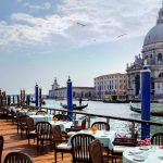
These muted neutrals combine Japanese and Nordic design sensibilities. Extremely versatile, together they will create soft, soothing environments. Influences are: Minimalism, Serenity, Scandanese and Sanctuary. (The first image in post is also Mantra.)
Play


Fun, bold and bright. These colours feel upbeat and playful, especially the turquoise and bright pink. Use as splashes in artworks or cushions, or paint an accent wall, for a joyful look that’s full of warmth. Influences are: Escapisim, Joy, Humour and Energy.
I am especially excited about this palette as it is similar to what I have planned for our sailing boat, Lazy Kingfisher. On board we want to create a fun vibe where people can relax and put their worries aside. Take a look at my moodboard below:

Haven


Well, with this group it’s all in the name. Use this palette to create a home that feels like a hug. Inspired by nature, the richly subtle shades call to mind sea, sand, forest and sky. Influences for this trend are: Simplicity, Wabi-Sabi, Conservation and Material Health.
Heart


This warm palette of silky neutrals is inspired by humanity. Especially suited to retro or boho interiors, using them will create a comfortable, connected vibe. Influences are: Bauhaus, Bohemian, Fusion and Humanity.
Which palette is your favourite? I am anticipating seeing a lot of schemes using Mantra and Heart next year. And, of course, you’ll be seeing photos of Lazy Kingfisher when we finally get around to refitting the interior! XO 💕
All images (except moodboard) via Sherwin Williams.
[yikes-mailchimp form=”2″ title=”1″ description=”1″ submit=”Subscribe “]