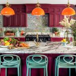
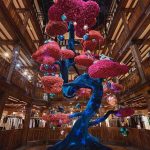
The Natural History Museum in London is having a design moment! It has inspired not just one, but two new interior collections. Despite being housed in one of London’s most impressive buildings, it is not necessarily the place you’d associate with home décor. However, new collaborations with Farrow and Ball and Divine Savages have resulted in some gorgeous new paint colours, wallpapers and fabrics.
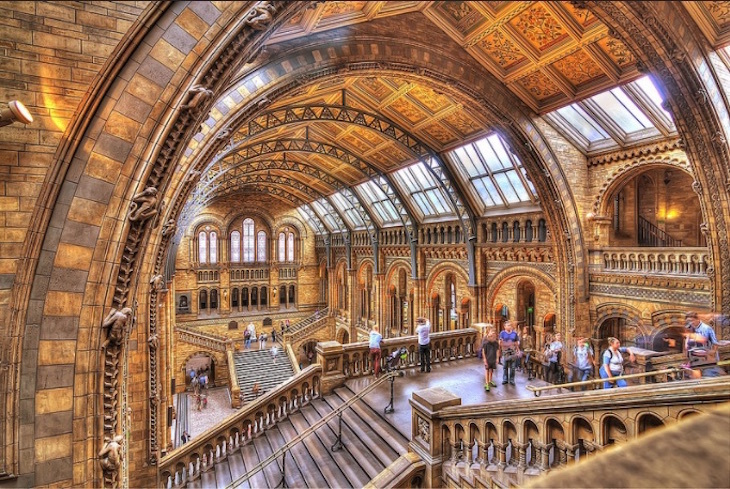
Although not the first place that springs to mind, when you consider the ongoing trend for bringing the outdoors in plus the wellness clan telling us to spend more time in nature you see that, in fact, the Natural History Museum is a rather obvious place to look for current interiors inspo.
Farrow & Ball X Natural History Museum
Farrow & Ball’s new paint collection: Colour by Nature is inspired by Werner’s Nomenclature of Colours. Published in 1814 this was an official classification of colours in nature. This equipped explorers of the time, including Charles Darwin, with the vocabulary they needed to describe the new world they were discovering. Werner’s Nomenclature has become a resource for both artists and scientists.
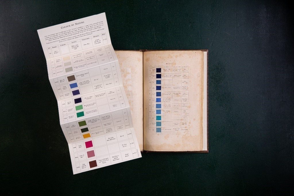
Farrow and Ball’s eco-friendly water based paint collection consists of 16 colours that are found in nature. There are strong deep colours, a couple of vivid hues and then soothing neutrals to tie your scheme together. Check out the collection below:
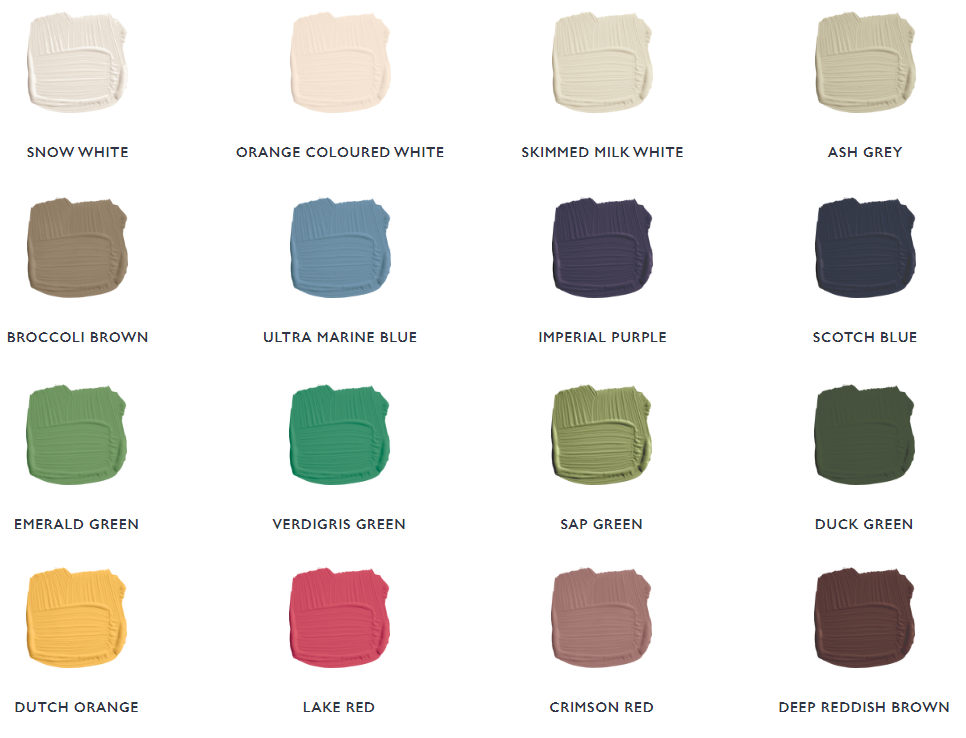
I am particularly drawn to the warmth of the Dutch Orange and Lake Red. They seem perfectly suited for this time of year, reminiscent of the colour of autumnal leaves. But I equally love Scotch Blue, I think the dark inkiness would look great on the walls and even the ceiling of a moody bedroom. Which colours do you like best?
Inspiration for using the paints
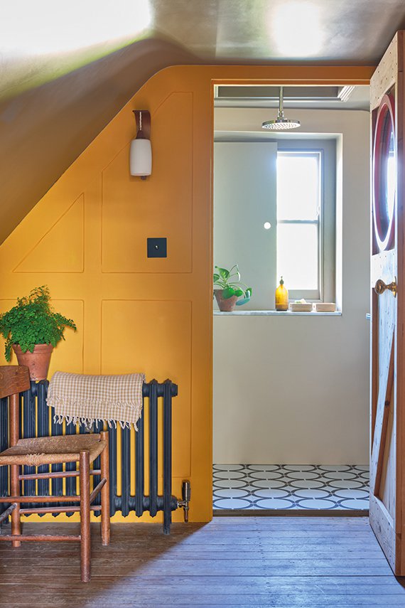
Dutch Orange taps into the Mustard trend that is prevalent this autumn. You can see how the warmth and brightness of the colour brings this dark alcove alive. Looking into the shower room you can see the colour is pulled through by the glass apothecary bottle on the windowsill. Pairing it with a warm white with strong orange undertones further warms up the space creating an overall glow, perfect for an unloved dark spot or north facing room.

Green is the universal colour of nature and here it livens up and adds vibrancy to this industrial space. It also highlights beautifully the concrete staircase. The cool, crispness of the pure white Snow White provides a clean contrast.
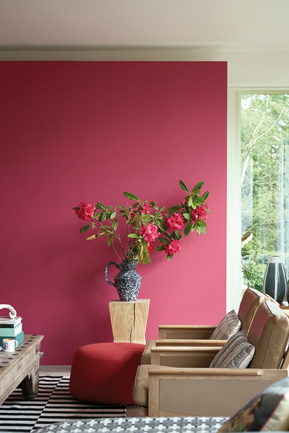
Here you can see how adding a strong colour like red does not necessarily have to be overpowering. Somewhere I heard the expression “start small, paint a wall” as an approach for those wanting to add colour but who are a little afraid. Here you can see exactly how that works. The rest of the room is very neutral, only the ottoman and roses echo the wall colour and these are kept close to the wall so as they almost blend in. This pinky red is a happy colour and pairing it with a soft muted white like Skimmed Milk gives an overall laidback, relaxed feel.
Divine Savages X Natural History Museum
Divine Savages create beautiful, dramatic wallpapers and fabrics for daring, maximalist homes. The new collaboration with the Natural History Museum has been inspired by specimens, original illustrations and paintings from centuries of exploration of our flora and fauna. If you are looking for something show stopping, keep reading…..
Forbidden Bloom
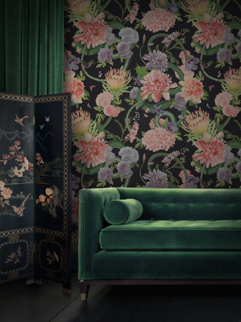
The dark dramatic florals of Forbidden Bloom are interspersed with serpents, inspired by the botanical and reptile collections. It looks great here, teamed with a green jewel shade of velvet and a chinoiserie screen. Not for the faint hearted, this will create a wild, romantic vibe. Alternatively buy the print on fabric and get some floor length curtains made. For just a splash, choose a cushion. Also comes in ‘Blush’.
Hierarchy
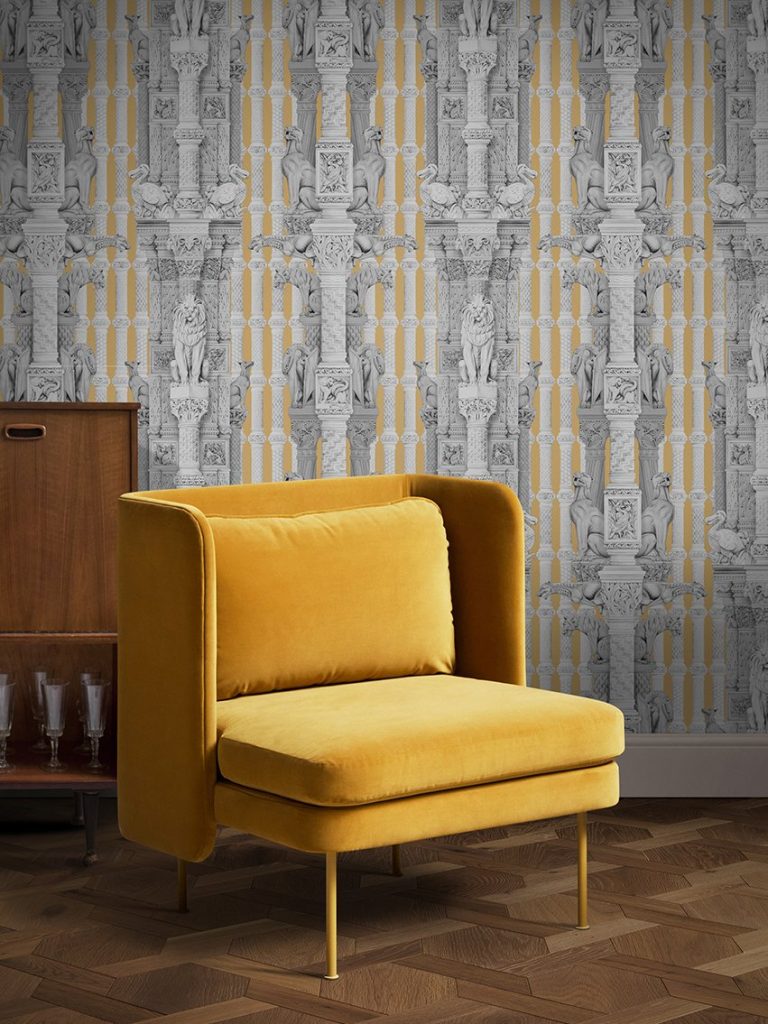
This pattern is taken from the intricate stonework found on the exterior of the museum. The graphite drawings depict stone columns and animals with focus on the lion. Light, bright stripes run in between the drawings giving this a whimsical almost circus like feel. Here we see it in ‘Mustard’ (as mentioned above very on trend), but it comes in 3 other colourways: light blue, baby pink and pale grey.
Botanize
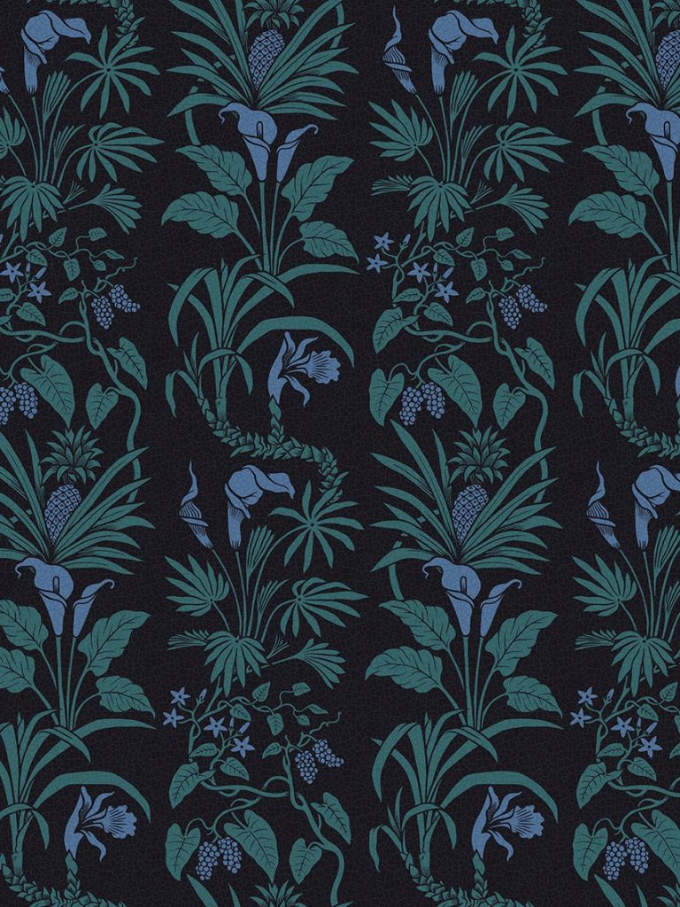
I’m guessing not many people look up when they enter Hintze’s Hall. If you do you will see, in the soaring ceiling, 162 illustrated wood tiles with detailed botanical paintings. This is what inspires the Botanize design. I love the “Blackberry” colourway shown above. The bluey purple looks almost iridescent. This comes in a velvet or a linen.
Botanize Heritage
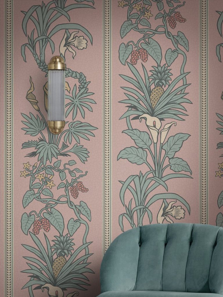
Here, a border has been added to the Botanize design. I think the ‘Plaster Pink’ has a bit of a 1980’s Tropicana vibe; a combination of the hazy pink and green and the pineapples. This would look lovely in a conservatory or a room that gets a lot of light.
Botanize Grasscloth
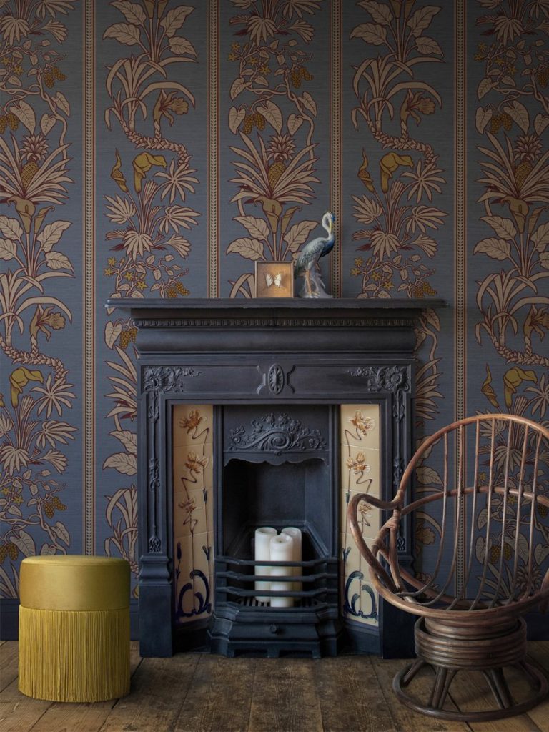
With Botanize Grasscloth the design is taken a step further here. Printing it on metallic grasscloth adds a little shimmer and an extra touch of luxury. Choose for maximum impact. I love it, as seen above, in the ‘Whale Blue’ colourway.
Images via Farrow & Ball and Divine Savages
So, one source of inspiration two very different ways to bring nature into your home. Which way are you leaning? XO 💕

